Here’s Anna Castagnoli‘s third post on her experience on being a judge for the Bologna Children’s Book Fair’s Illustrators Exhibition. I apologize for any shortcomings in the translation, which would be solely my fault.
If you want to see the original post in Italian, go to Anna’s blog, “Le figure dei libri.”
Salumeria Tamburini in Bologna
Day 3
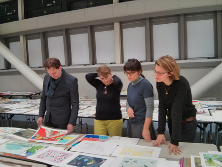
The large hall was changing appearance; we were now moving around fewer tables. Some had been cleared to leave room for the final selection. In the back, staff members were carefully placing in folders the works discarded the previous days.
The exhibition was to include about eighty illustrators. Among the 160 piles survived from the earlier selections, we had to choose roughly seventy (ten, the ones with four stickers on, had already been put aside). We began with the discussions: the job of a judge is not to have opinions, but rather to translate into clear language every little thought, taste, or feeling.
The level of the discussion was very high. We had persuasive arguments, which we were sharing with passion. We were all so good at defending our ideas, that we ran the risk of getting stuck. After discussing the third work, we decided to take a break. Isabel Minhos found the right words to get us started again: our goal was not make one’s opinion prevail over the others’, and it was not a tragedy if we eventually had to leave out one judge’s favorite illustrator. We could not have our personal dream show.
That’s when I understood that we were a group, and that we were to select the show as a group, in a way putting aside our selves. The exhibition would have been precious because it would mirror something that none of us could have predicted before our getting together. And that’s how it went.
An illustration changes when paired with a text
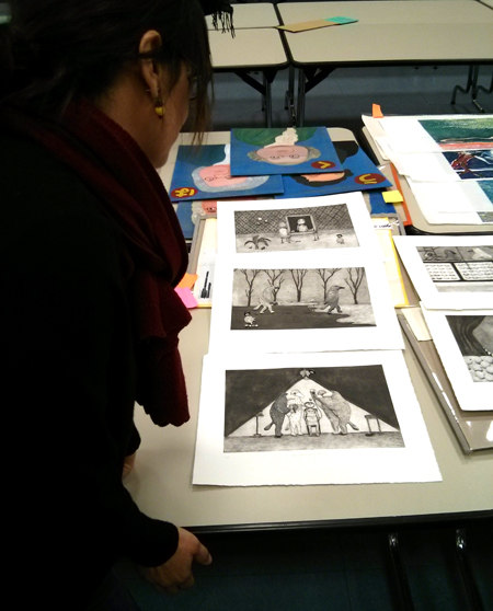
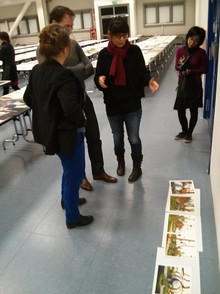
We started to spread the drawings on the floor and make up stories based on them, to see if those images would have worked in a kids’ book, knowing that a text changes considerably the perception of an image. Sometimes there was no way to see what story would have worked with the the images: “They’re too much like postcards,” one of us would say, “rather than moments of a possible story.” “Could they be paired with a poem?” another would ask, without being too convinced. “What if we moved these to the non-fiction category?” “No, they’re not descriptive enough. We can’t. Let’s go to the next.”
An illustration is not a poster nor a painting to be hung on a wall.
The images had to have the right qualities that make an illustration an illustration: not a poster, or a painting for a museum, or a picture for a trendy magazine. In a book, each single image is a moment of the story. In a way, a book illustration needs to be an incomplete passage (the rest of the illustrations in the book will complete it).
Of course, the language of the children’s book is changing. The “new wave” style about which many have complained in the past years was not solely the jurors’ fault. It was really difficult to find, among those thousands of images, a traditional narrative style. We had to find these characteristics trying to decipher new languages. We also had to evaluate illustrations expressed in “languages” we were not familiar with (in works from Iran, Japan, Korea, China, Argentina…)
We had to take the time to understand all that, and we did. Sometimes we would read the title on the back of the drawing, to get some help. We discussed a lot. There was one quality that we all considered essential: an image had to “invite you in.”
There were images one had the feeling of entering into (or falling into, since we were looking from above). Even when they had flat field of color and no perspective, they called us in and get us involved.
The world represented had its own rules: they may have been absurd, but they were coherent. Other images stayed on the paper, without creating any world. More than anything, we didn’t feel they had a soul, to use Kitty Crowther’s expression. From a stylistic point of you, it is difficult to pinpoint such mysterious quality in a drawing, but here are a few focal points singled out by Kitty, Isabel, and Errol:
– Quality of the technique
– Stylistic consistency
– Richness and diversity of the composition
– Honesty (one thing is being inspired by other artists’ work; another is copying. We would get rid of anything we would consider “already seen,” or cliché)
– Ability to experiment and research new languages
– Storytelling
– Ability to capture the reader: freshness, energy; ability to surprise, involve, even disturb the reader
– Ability to see the world from a child’s point of view and his or her need of adventure, exaggeration, deep feelings, with a specific regard to gender; we asked ourselves if there is a difference in the way a boy and a girl perceive illustration: do boys need more adventurous, less embellished images? [I don’t think so! S.R.]
– A sound content: one that doesn’t try to hide or edulcorate the truth
– Attention to the relationships between the characters
We had decided that each of us could use one wild card, which we could use in order to have one illustrator in the show, even if the other three judges didn’t like the work. We saved it for the right occasion. It was more fun to explain one’s reasoning and try and make the others change their minds. Often, we would succeed. Once one found the right words, that’s it! we would all get it. The very way we looked at an image would change. It was incredible, for me, to learn so much. The other judges as well had the same feeling of growing and learn to shift one’s point of view.
It was good to present the “yeses” to the organizers or to Deanna, who were always waiting behind us. “Is this a yes?,” they would ask, with hope. “Yes, it is a yes!” we’d answer, with great relief, almost as we had just helped a baby be born. Little by little, the table for the accepted works was getting filled with images.
Something that never tires you; that slips away…
Many images to which we eventually said “yes” to had this quality: we never grew tired of looking at them. We would gladly go back to them, again and again, to wonder about them. They were not necessarily perfect, or beautiful. They could even have flaws. Sometimes, we didn’t even really like them. But they had something that we couldn’t quite grasp, that gave them a vibration, an intensity, a strength that never wore out; in that case, we would say “yes.”
Plagiarism
One ground for exclusion was when the presence of another known illustrator was too obvious in the image. We found: 3 fake Géraldine Alibeu, 1 fake Maurizio Quarello, 1 fake Quentin Blake (for a moment we thought it was Blake himself who sent those drawings in in order to test us), 2 fake Beatrice Alemagna, 1 fake Isabelle Arsenault, 1 fake Jockum Nordström, and 2 fake Wolf Erlbruch from Germany.
For what concerns other continents, it’s possible that some plagiarists passed through. But for the Europeans, we felt quite secure.
But… Suddenly, five giant little girls pop in front of our eyes. They are dancing, or more simply put, they stand there. They have one eye, like cyclops. They are sweet, nice, enigmatic. The technique used to create them is very similar to Beatrice Alemagna’s: similar collage method, similar colors, similar style. But in those little figures there was something original and new. We decide we want them in the show. Soon after, we ask each other: who’s going to tell Beatrice? The thing is, we thought that it was not too bad to copy a little, if what you are able to say is new and original.
Digital illustrations
The percentage of digital images was quite low, maybe 10%. For the next editions of the show, keep in mind that the Fair prefers original works, since the primary goal of the selection is an exhibition. Obviously, if the quality was high enough, we didn’t discriminate. The problem was that most of the work was poorly printed, on cheap, thin paper. If you want to submit digital pictures, print your pieces on good, matte paper, from high-res files. And do include your preparatory drawings or sketches.
Previously selected illustrators
There were a number of illustrators who had been selected in the past editions. In a few cases, they won us over. In other cases, we wanted to make sure their work had evolved since the last time: if it didn’t, we wouldn’t select them, leaving room for new artists.
We skipped lunch, eating only a few chips from a tray. There was too much work to be done. I felt like I was bursting with joy: the critical work I was doing, the debate around the language of children’s book illustration is what I most love in my job. For once, I forgot that I get weak when I don’t eat.
In the next and last post I will tell you specifically of some of the work we chose and why we found that work innovative.
And that will be it.
Anna Castagnoli
THANK YOU !!!
Thanks, Anna and Sergio. Illuminating!