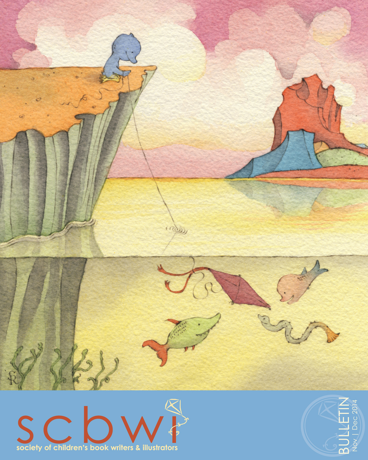
Teachers! Librarians! Bookstore event coordinators! Parents! Kids!
Here’s a little bundle of ideas for your drawings. Click on the image below to download the PDF, and enjoy!
Teachers! Librarians! Bookstore event coordinators! Parents! Kids!
Here’s a little bundle of ideas for your drawings. Click on the image below to download the PDF, and enjoy!
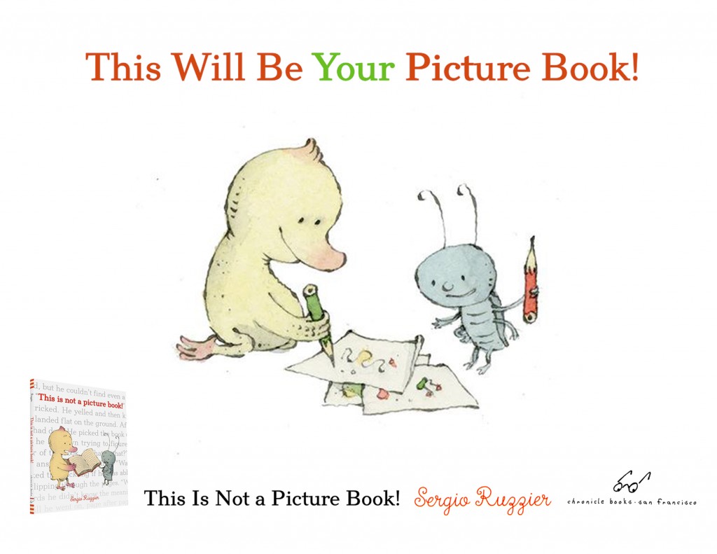
Some reviews for This Is Not a Picture Book! have come out. As usual, Publishers Weekly and Kirkus were the first ones, and they both gave my new book (my first with Chronicle) wonderful, starred reviews. More recently, School Library Journal published their own starred review.
This isn’t a book about books; it’s a book about learning to read. A duckling with a pink beak picks up a fat volume and discovers, in the irritated comment of the title, that it has no pictures. “Can you read it?” asks his sidekick, a bug. “I’m not sure,” says the duckling. “Words are so difficult.” In luminous watercolors, Ruzzier (Two Mice) shows the duckling and bug crossing into a strange, many-colored world, where unfamiliar words are represented as odd machines, blobby shapes, and bizarre creatures. When the duckling stumbles on a word he knows (“bee,” “flower”), its recognizable image pops up among the mysterious ones. Duckling and bug wander through the ever-changing landscape of reading—“There are wild words… and peaceful words”—before landing cozily in bed. Ruzzier’s story offers gentle empathy for kids tackling this intimidating task. Observant readers will note that the endpapers represent learning to read, too; the initial pair retells the story as a beginner might see it, with most of the words scrambled, while the words of the final endpapers read clearly—and no pictures there, either.
And here’s what they think at Kirkus:
A metafictive delight of a picture book.
Alice would be pleased: despite Ruzzier’s title, there are plenty of pictures and ample conversation in this picture book. The titular book within the book, however, is illustration-free. This initially causes distress for the duckling protagonist (who oddly has a bellybutton, but that’s beside the point) who finds the book in the spreads before the title page. When a bug appears and asks, “Can you read it?” the duckling gives it a try. In a brilliant feat of page layout, the recto depicts a green landscape encroaching on the verso, with a log laid across a chasm as a bridge to the white space on which the duckling and bug stand. Their walk across the log is a visual metaphor for the duckling’s successful decoding of the text in its pictureless book. Whole worlds open up to them as the duckling reads aloud. Illustrations depict these worlds evoked by “wild words… / and peaceful words,” and the duckling ultimately declares that “All these words carry you away.” The satisfying conclusion is an affirmation of the transformative power of reading. In one outstanding design touch, the front endpapers tell the not-a-picture-book text in garbled type with transposed letters that one must strain to decode, while the text is clear in its entirety on the back ones.
School Library Journal:
In this winsome examination of the power of words, a little duckling is delighted to find a red book lying on the ground. “Where are the pictures?!” the fuzzy yellow bird exclaims in dismay upon opening it up. The duck flips through the pages, scanning the plethora of print, and begins to recognize some of the words. His interest and enthusiasm flourish as he continues, reading words that are funny and sad, wild and peaceful. His imagination takes off, and along with his tiny cricket friend, the duckling is swept away on a fantastic adventure. He tells the little insect, “All these words carry you away…and then…they bring you home.” The straightforward tale is enhanced by endpapers featuring lines of text, which are jumbled in the front and placed in order to relate the duck’s story in the back. The eclectic pen, ink, and watercolor illustrations add color and energy to the narrative. At first, the pictures are set against a canvas of white space and then slowly expand as the duck begins to envision scenes with each additional word he reads. One of the final spreads portrays the duck and his friend safe at home in his bedroom, which contains a shelf crammed with books.
I can’t wait to know what the others think!
This year I was one of the five jurors of the Bologna Children’s Book Fair Illustrators Exhibition. In the beautiful catalogue published by Corraini, I was asked a few questions on creating picture books and more.
The five jurors: Klaus Humann, Nathan Fox, Francine Bouchet, myself, and Taro Miura.
You have said in the past that there are so many obstacles and taboos when creating children’s books, that you run the risk of censoring yourself. How do you avoid self-censorship?
I was specifically referring to the U.S. market, where all my children’s books so far have been originally published.
I consider myself fortunate to have found such a fertile ground for my ideas and my style, and I doubt that I would have been able elsewhere to make my passion for picture books into an actual profession. I am very grateful to the editors who saw potential in my work, beginning with the unforgettable Frances Foster.
There is, of course, the other side of the coin. Compared to what gets published in other Western countries (Germany, for example, or France, or, perhaps to a minor degree, Italy), American books for children tend to be very tame. There are glaring exceptions, of course, but generally speaking you don’t see books that deal with issues that are considered too mature for the audience: death, sex, war, violence, depression, and so on. When books on such themes do get published, they tend to be heavily weighed down by a predictable message, and illustrated incompetently. There is the widespread belief that children need to be shielded from the reality of life. That, in my opinion, is a huge mistake, and is akin to lying. Of course I’m not suggesting that children’s books should include pornography or gratuitous violence, but if a story calls for it, one shouldn’t shy away from showing unpleasant situations. The risk of self-censorship I was talking about is always looming, and can be difficult to detect.
When writing a story, or drawing a picture, you do feel the pressure to deliver something free of possible controversy, or to make choices based on specific political agendas. But in order to produce the best possible work, the only pressure you should feel is the pressure to be true to your own voice.
When creating a children’s book, do you ever have a precise image of your ideal reader in mind?
Absolutely not. I don’t think of the reader at all. I believe that when writers think too much about who’s going to read their book, the result will be formulaic at best.
Which illustrated book would you have liked to have authored? Why?
There are so many authors and illustrators I worship and whose books I hold dear. In general, I’m drawn to unusual stories that are beautifully illustrated without trying to impress. I can’t stand authors who follow a trend and illustrators who want to show off without even possessing the appropriate skills. Warmth, sincerity, and irony are the main qualities I always look for in a book.
Arnold Lobel’s Frog and Toad stories are among the most profound, funny, endearing books I’ve ever read. The drawings perfectly match the tone of the text, at the same time melancholic and reassuring. William Steig, Maurice Sendak, Tomi Ungerer, Edward Gorey: they all have created wonderful books that keep inspiring and humbling me.
But if I have to pick one single book, it would probably be Wolf Erlbruch’s Duck, Death, and the Tulip. I’ve never seen anything like it. It’s a death dance for children. It’s original, powerful, sweet, compassionate, sad, comforting. It’s done with such measure and good taste. I would be happy if I could produce something comparable to that book.
My new picture book Two Mice came out in September. It is making quite an impression among the international intelligentsia.
Here are some comments, and I’ll keep updating as more will come by:
“TWO MICE are better than one.“—Walter E. Disney
“Sergio Ruzzier’s TWO MICE is mousetastic.” —Beatrix Potter
“I just ♥ how in TWO MICE Mr. Ruzzier lets the pictures tell the story.” –Randolph Caldecott
“The most learned, acute, and diligent student cannot, in the longest life, obtain an entire knowledge of TWO MICE.” –Sir Walter Scott
“If one cannot enjoy reading TWO MICE over and over again, there is no use in reading it at all.” ―Oscar Wilde
“TWO MICE is, like, wow. Just… wow.” —J.M. Barrie
“No man remains quite what he was when he reads TWO MICE.” —Thomas Mann
“Within the covers of TWO MICE are the answers for all the problems men face.” ―Ronald Reagan
“1, 2, 3, 3, 2, 1… That’s insane! TWO MICE is blowing my mind!” —Leonardo Fibonacci
“TWO MICE is fabulous!” —Aesop
“A thorough knowledge of TWO MICE is worth more than a college education.” —Theodore Roosevelt
“There was a good book called Two Mice,
That offered this piece of advice:
When leaping o’er cracks
You should never be lax—
Lest you wind up with less than two mice.” —Edward Lear
“OMG, look at those tiles. The perspective! How does he do it?!” —Piero della Francesca
“Look deep into TWO MICE, and then you will understand everything better.” —Albert Einstein
“I can’t believe those TWO MICE like veggie soup.” —The Subway Pizza Rat
“The first and almost the only book deserving of universal attention is TWO MICE.” –John Adams
Two Mice made it into three best-books-of-the-year lists!
I mean four!
Sorry: five!


![]()
Julie Roach writes on the Horn Book:
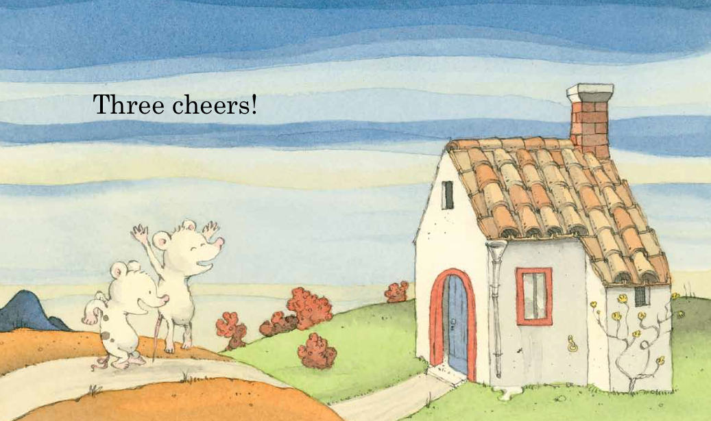
Using only two-word phrases (“One house / Two mice / Three cookies”) and a simple repeating number pattern (one, two, three; three, two, one; one, two, three), this clever book (with an extra-small, preschooler-perfect trim size) creates a fast-paced adventure for listeners and new readers alike. Expressive, mildly mischievous pen-and-ink illustrations in soft colors develop details and drama that the words leave out. For instance, in the pictures, when the two mice “share” three cookies, the spotted mouse gets two cookies, while the plain mouse, miffed, gets only one. Before long, the mice venture out to sea (“Three boats / Two oars / One rower”), and this time it’s spotted mouse who does all the work, while plain mouse takes it easy in the boat’s stern. Soon the situation grows dire — “Three rocks / Two holes / One shipwreck.” They nearly become a raptor’s dinner before managing “One escape.” The two work together as a team after this near- disaster, and “Three carrots / Two onions” lead to a final nourishing “One soup” that both mice are happy to share — equally. Sometimes the pattern leaves the reader with practical questions: how did “One nest / Two eggs” hatch into “Three ducklings,” for instance? But trying to fit together all the pieces is part of the fun, and the book’s creative focus on pattern in plot leaves plenty of room for readers’ imaginations to play a strong role.
Kirkus says:
The deceptively simple counting story of two mice, their adventure, and friendship. One morning in Ruzzier’s imaginative and colorful world, two mice wake to explore. The tiny window above the bed beckons: water, mountains, and sky are waiting for these two. Starting before the title and ending on the copyright page, minimal text says all that is needed: “One house / Two mice / Three cookies. / Three boats / Two oars / One rower. / One nest / Two eggs / Three ducklings.” New readers will soon notice the number pattern and slow down to see how the droll illustrations extend the story. For instance, the mouse with one cookie has an angry expression and a rather tightly curled tail, while the loose-tailed mouse looks gleeful as it chows down on two cookies. The sunny rowboat scene is not so sunny for the mouse who has to manage the two oars. By the time the two buddies return to their home, all is forgiven when the delicious soup is served. (And, in a visual nod to Sendak, it is clearly “still hot.”) The small trim size and careful attention to details give this book enormous appeal; the decorative floor tiles, ornamental feet on the kitchen table, and mismatched stools fit right in with the red hills and ever changing sky. The simplicity of the text means that the earliest readers will soon be able to pick it up and will return to it over and over. One story. Two mice. Three cheers. Lots to love.
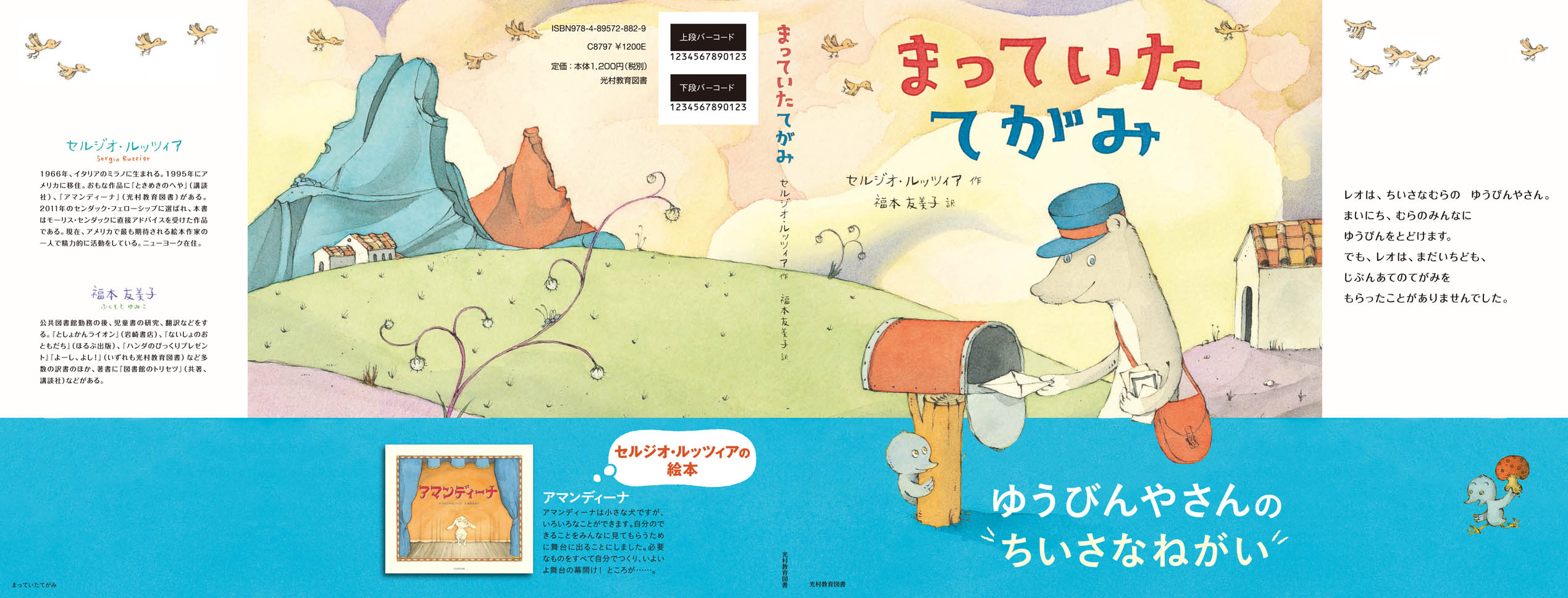
Here’s the jacket of the forthcoming Japanese edition of A Letter for Leo, published by Mitsumura (which already published my Amandina a few years ago). The blue band is the obi, the traditional paper strip that wraps the book jacket. Yumiko Fukumoto translated the text, as she did for Amandina and The Room of Wonders. (Click on the image to enlarge it.)
I wrote this piece for this year’s illustration issue of The Horn Book. They graciously let me post it here as well.
I don’t like to experiment.
I know it sounds pusillanimous, but I’m just being honest: I don’t like to experiment because I am afraid of failure.
But at least two times in my life – at the very beginning of my artistic life – I found enough courage and determination to take risks. I was a fearless teenager then.
Being already passionate about picture books and comic strips – in particular those of Maurice Sendak, George Herriman, Elzie C. Segar, and Charles Schulz – it was clear to me how important would be to master pen and ink, if I wanted to be in that business.
Maurice Sendak
George Herriman
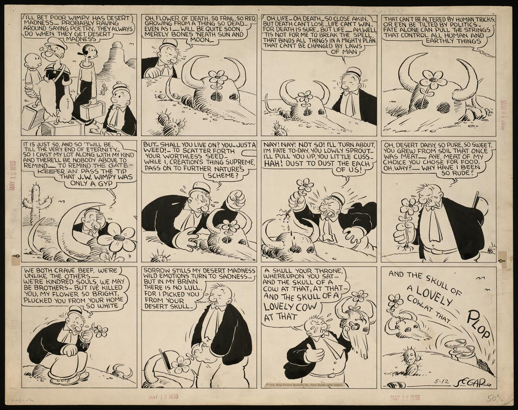
Elzie C. Segar
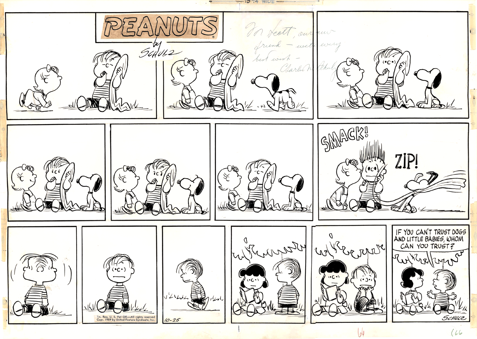
Charles Schulz
Each of those artists had a very sophisticated and personal way of using the pen, and I wanted to find my own.
I remember going to the stationary store to buy my first two nibs, one very flexible and the other stiffer; then returning home and try them on the paper, keeping my hand from trembling; realizing I had to go from upper left to lower right to avoid; understanding how different pressures produce different lines; learning what kind of paper had the best surface for the kind of line I wanted to make.
In time, I did find my own way with pen and ink, which became my favorite and, for a few years, my only way of drawing. Most comic strips, at least the dailies, were in black and white, and I knew that even Sendak’s illustrations for Little Bear – a crucial source of inspiration for me – were colored mechanically. Because of all this, I didn’t think the lack of color in my drawings would be an obstacle in my future career as an illustrator.
Of course there was a hidden reason why I didn’t use color: the fear of failure. I had a fascination for Hieronymus Bosch, medieval frescoes and illuminations, so how could I not realize how important color can be for an artist? In fact, I had timidly attempted one or two small acrylic and a few oil pastel paintings, with very disappointing results, at least according to my overpowering superego. Those painful experiences kept me from seriously trying for years.
Once I became more conscious of the necessities of a professional illustrator, I couldn’t hide anymore, and had to face the challenging task of finding myself a method to add color to my pen drawings.
The most natural way to do that is watercolor, and so one day I went to an art store, bought a few half-pans of Schmincke watercolors, a brush or two, some Arches paper, and began testing the technique and my own resilience. For what concerned the techniques, I was set.
Maybe one day I will venture into buying a new kind of nib, or a new brand of watercolors, or even be audacious enough to try a paper with a slightly smoother surface. Who knows. For now, more than twenty-five years later, I’m still recovering from that initial double stress.