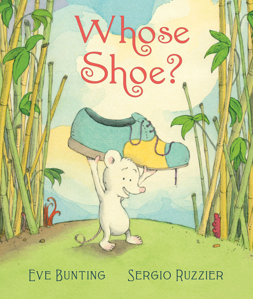
 Whose Shoe? was published by Clarion Books in June 2015.
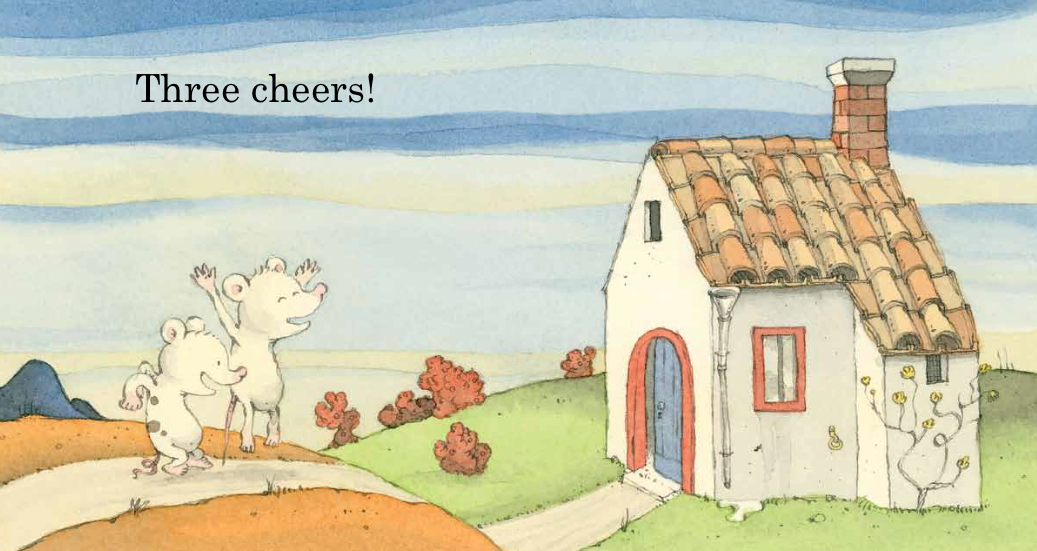
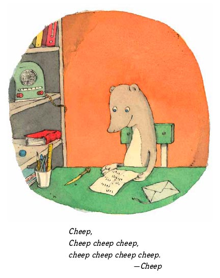
Three cheers!
by •
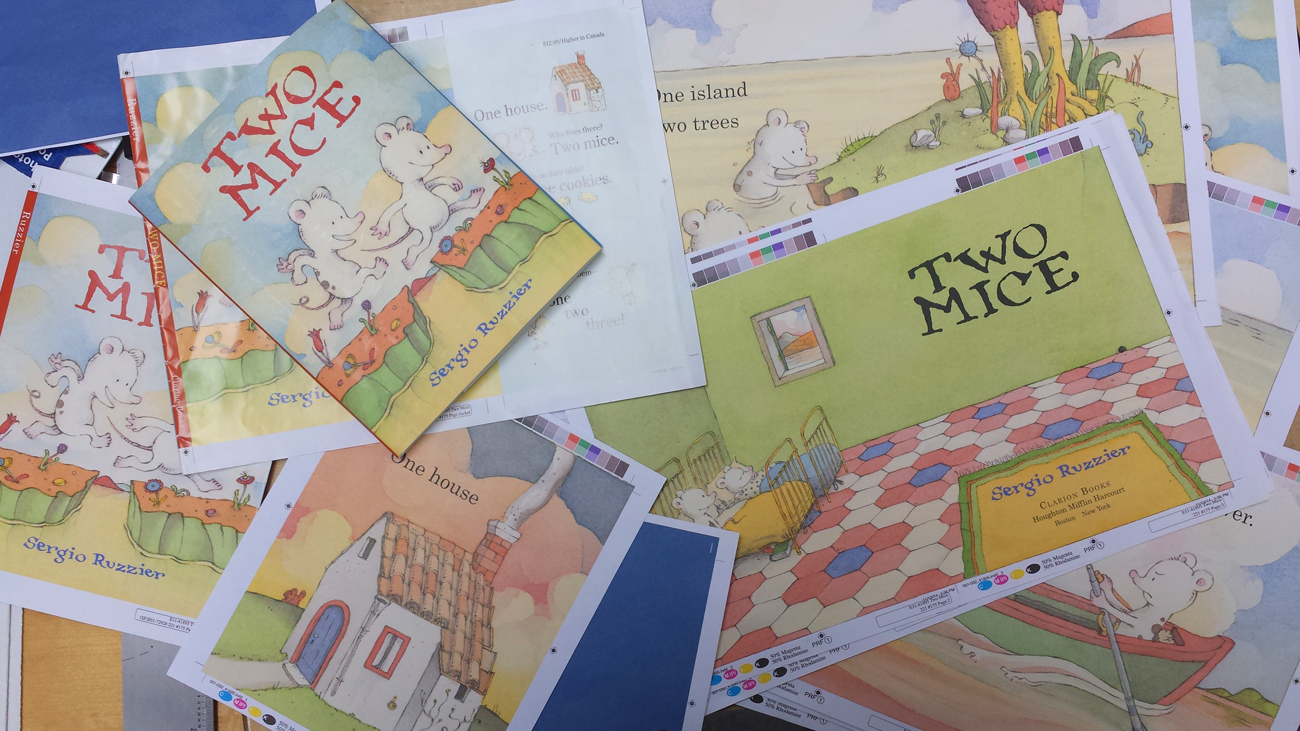
Two Mice proofs
by •
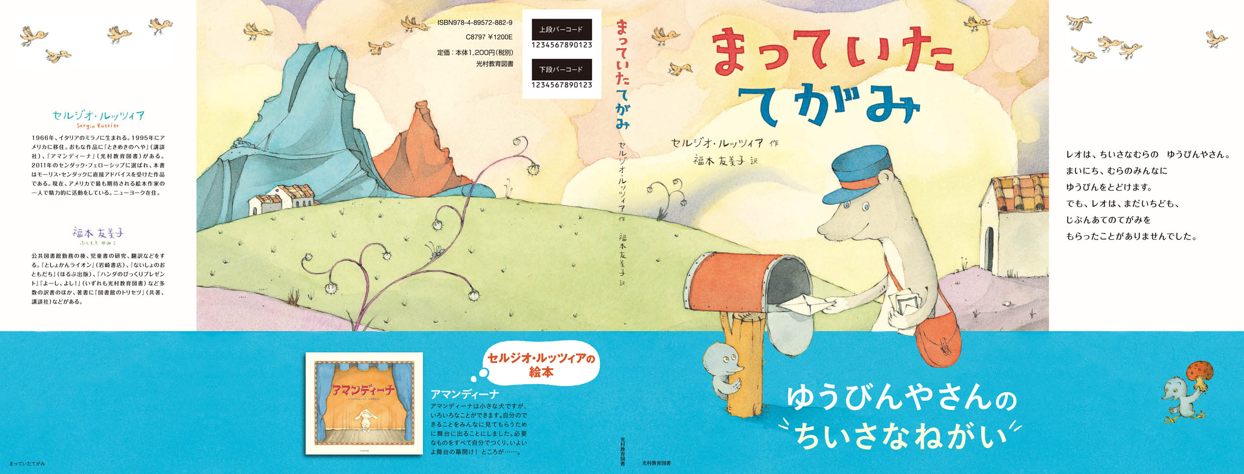
“A Letter for Leo” in Japanese!
by •
Here’s the jacket of the forthcoming Japanese edition of A Letter for Leo, published by Mitsumura (which already published my Amandina a few years ago). The blue band is the obi, the traditional paper strip that wraps the book jacket. Yumiko Fukumoto translated the text, as she did for Amandina and The Room of Wonders. (Click on the image to enlarge it.)
For the Fear of Failing
by •
I wrote this piece for this year’s illustration issue of The Horn Book. They graciously let me post it here as well.
I don’t like to experiment.
I know it sounds pusillanimous, but I’m just being honest: I don’t like to experiment because I am afraid of failure.
But at least two times in my life – at the very beginning of my artistic life – I found enough courage and determination to take risks. I was a fearless teenager then.
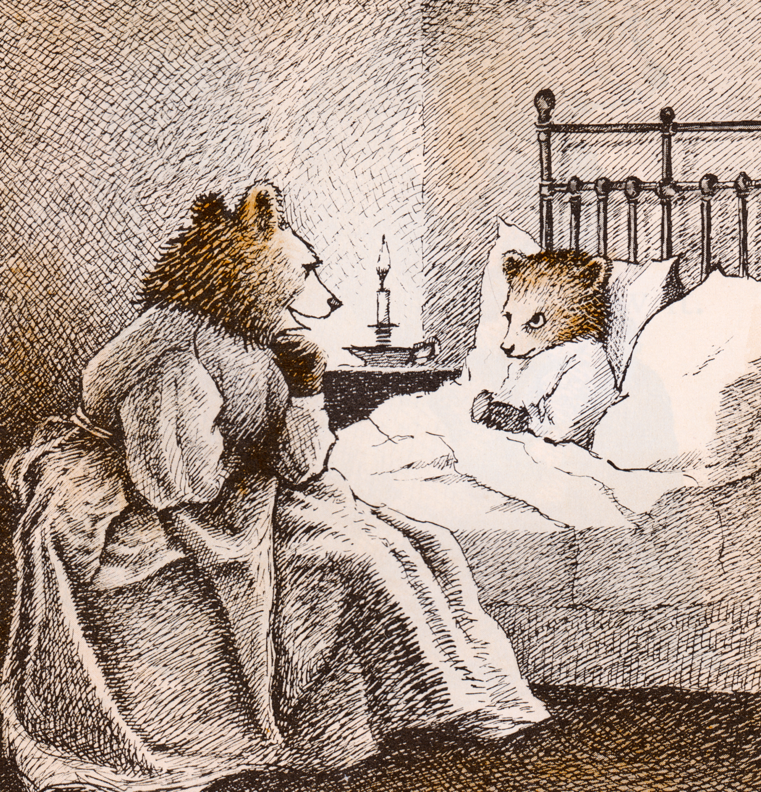
Being already passionate about picture books and comic strips – in particular those of Maurice Sendak, George Herriman, Elzie C. Segar, and Charles Schulz – it was clear to me how important would be to master pen and ink, if I wanted to be in that business.
Maurice Sendak
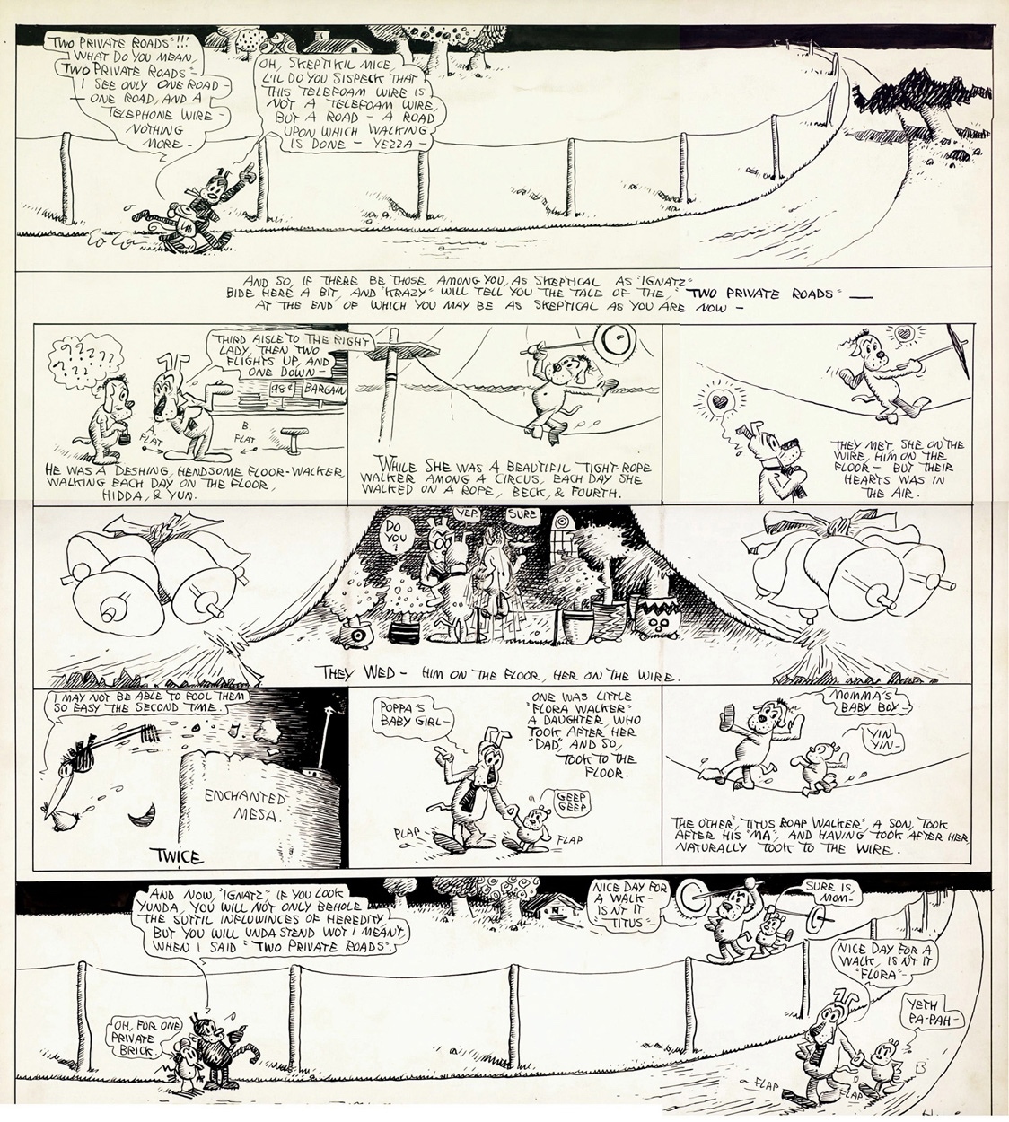
George Herriman
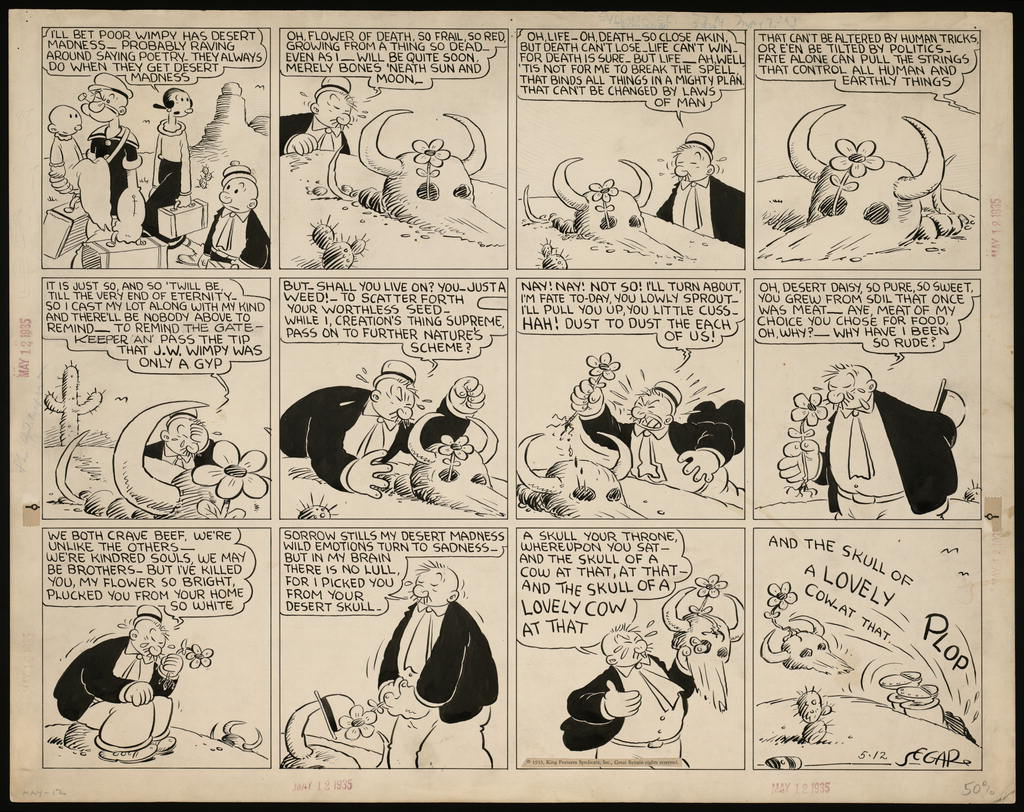
Elzie C. Segar
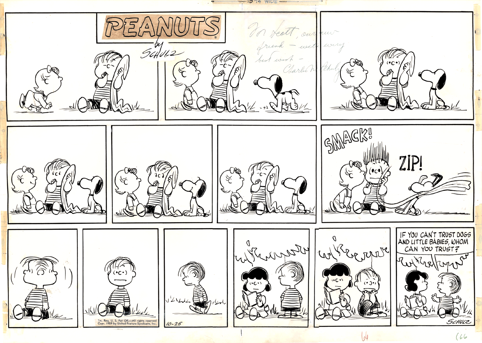
Charles Schulz
Each of those artists had a very sophisticated and personal way of using the pen, and I wanted to find my own.
I remember going to the stationary store to buy my first two nibs, one very flexible and the other stiffer; then returning home and try them on the paper, keeping my hand from trembling; realizing I had to go from upper left to lower right to avoid; understanding how different pressures produce different lines; learning what kind of paper had the best surface for the kind of line I wanted to make.
In time, I did find my own way with pen and ink, which became my favorite and, for a few years, my only way of drawing. Most comic strips, at least the dailies, were in black and white, and I knew that even Sendak’s illustrations for Little Bear – a crucial source of inspiration for me – were colored mechanically. Because of all this, I didn’t think the lack of color in my drawings would be an obstacle in my future career as an illustrator.
Of course there was a hidden reason why I didn’t use color: the fear of failure. I had a fascination for Hieronymus Bosch, medieval frescoes and illuminations, so how could I not realize how important color can be for an artist? In fact, I had timidly attempted one or two small acrylic and a few oil pastel paintings, with very disappointing results, at least according to my overpowering superego. Those painful experiences kept me from seriously trying for years.
Once I became more conscious of the necessities of a professional illustrator, I couldn’t hide anymore, and had to face the challenging task of finding myself a method to add color to my pen drawings.
The most natural way to do that is watercolor, and so one day I went to an art store, bought a few half-pans of Schmincke watercolors, a brush or two, some Arches paper, and began testing the technique and my own resilience. For what concerned the techniques, I was set.
Maybe one day I will venture into buying a new kind of nib, or a new brand of watercolors, or even be audacious enough to try a paper with a slightly smoother surface. Who knows. For now, more than twenty-five years later, I’m still recovering from that initial double stress.
A Letter for Leo
by •
A Letter for Leo
by •
A Letter for Leo
by •
A Letter for Leo
by •
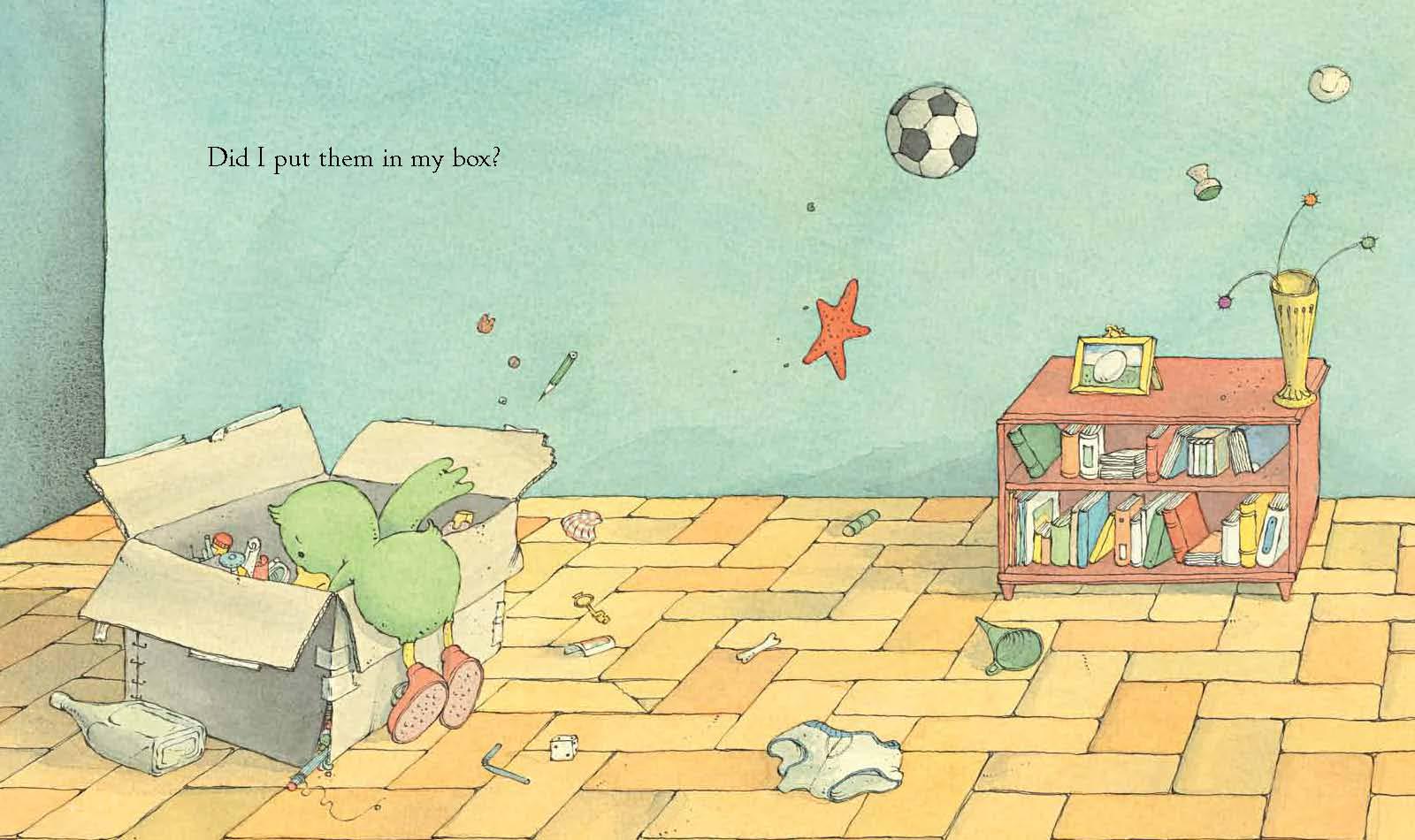
Have You Seen My New Blue Socks?
by •